
Timesketch is an open source tool that helps analyze forensic timelines. The hallmark of this app is the ability for collaborative teams to simultaneously conduct investigations within the same database. We designed a mark that represents both the app’s technical functionality and intrinsic value to the user.
In order to define the Timesketch brand identity, we went through a discovery phase. Using a word map, we distilled key defining words and phrases.

Timesketch word map during the discovery phase
The next step was to translate what we extracted into something visual that would ultimately function as the brand’s marker out in the wild.
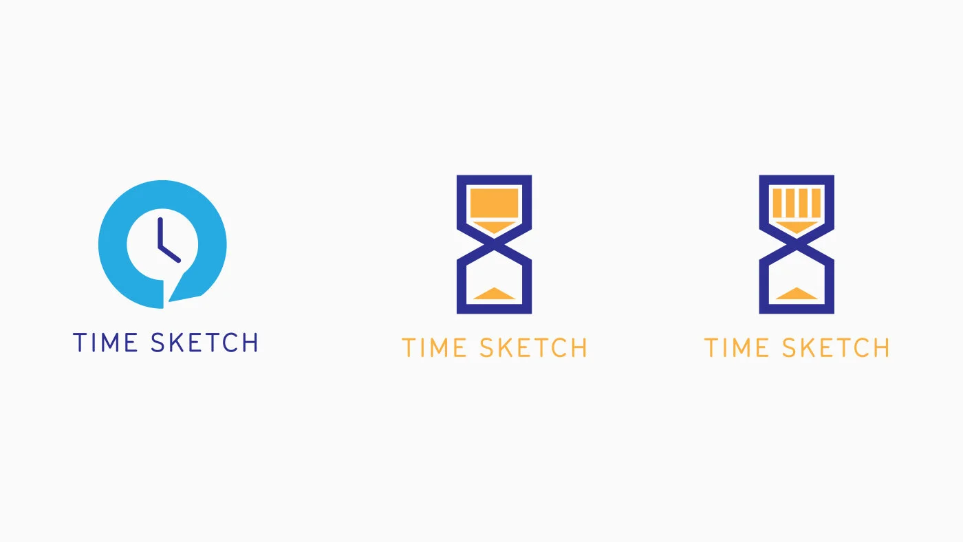
Early designs. Left: inspired by “time”, “sketching”, and “dialogue”. Middle and right: “inspired by “time”, “sketching”, and collaboration”.
While the early attempts could easily work as logomarks, they were too generic and could easily be adapted by other similar apps. They represented the function of Timesketch but they didn’t resonate its uniqueness.
Further along, we imagined what the deep end would look like. We imagined what the most abstract, all-encompassing, and total-representational visual mark could be.
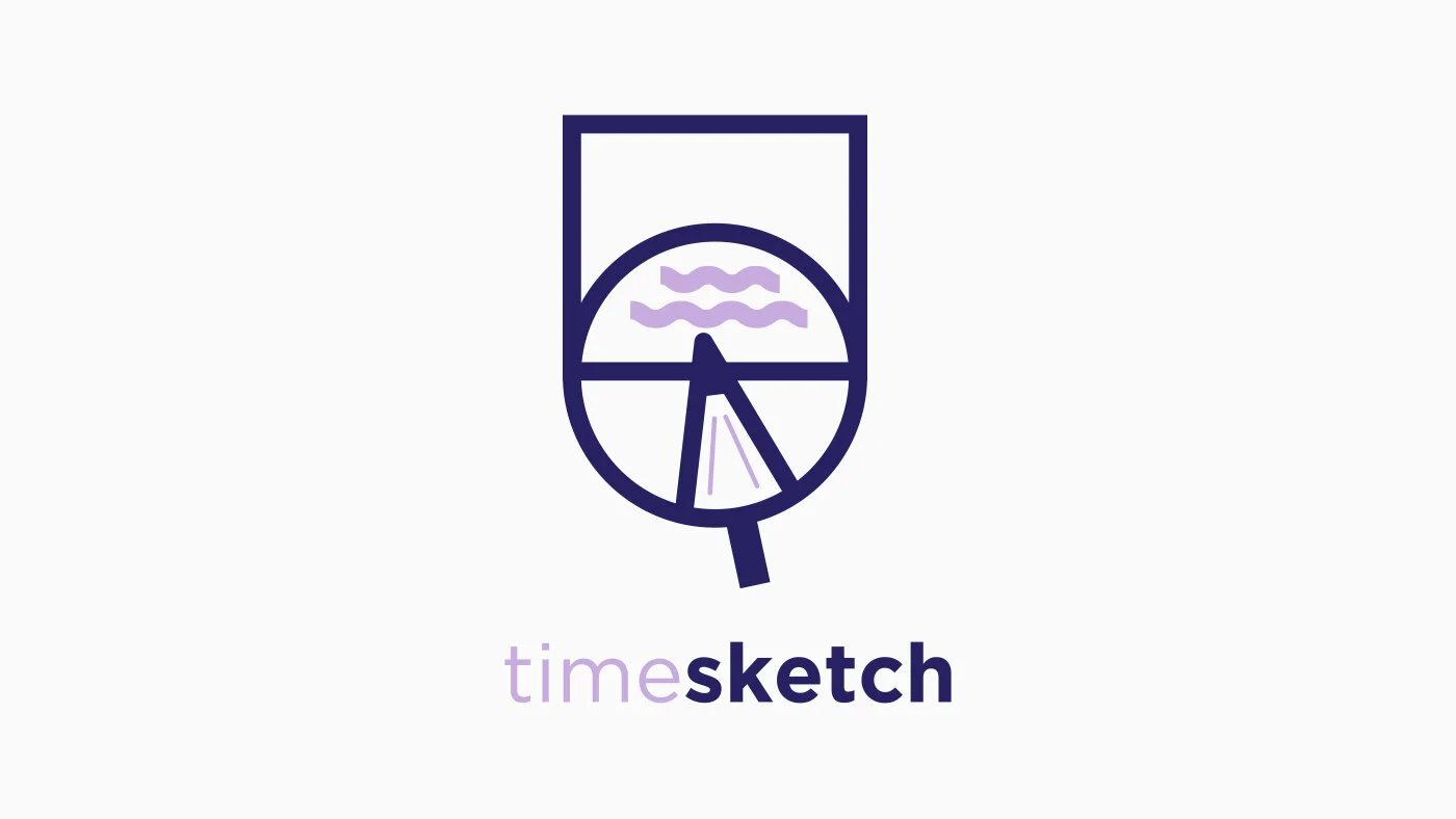
Our Frankenstein creation. (We still love it.)
After realizing design solutions that were too obvious and too abstract, we went back to the drawing board to re-think the design.

The spectrum of our design exploration
What we came up with is a mark with clear recognizable symbols upon first look and reveals Timesketch’s distinct merit upon further observation.

Timesketch logomark
The Timesketch logo can be broken down into the visible elements of a pen with connecting pieces that form a circle.
The Pen
Representing “sketch”, the pen is an abstraction of a whiteboard marker positioned in a way that “draws” the diagram.
The idea of “sketching” is given more emphasis over the idea of “time” because of the precedence of the problem-solving aspect of the app. Time is an element that already exists at the beginning of an investigation. The task of the user is to analyze time and “sketch” out a conclusion. In this same vein, the logotype presents “sketch” in bold letters while “time” is presented in a lighter text weight.
Connecting Pieces
The connecting half circles bring to mind the phrase “piecing the pieces together”—to gather bits and pieces of information to create a whole story.
It also represents the collaboration between teams and individuals.
The formation mimicking a Venn diagram nods to the origin of the name “timesketch”: connected dots and diagrams on a whiteboard to be analyzed and categorized.
The Circle
The Gestalt circle represents a clock and the idea of time.
The addition of clock hands were considered. But doing so would make give time the equal focus given to collaboration, problem-solving, and investigation.
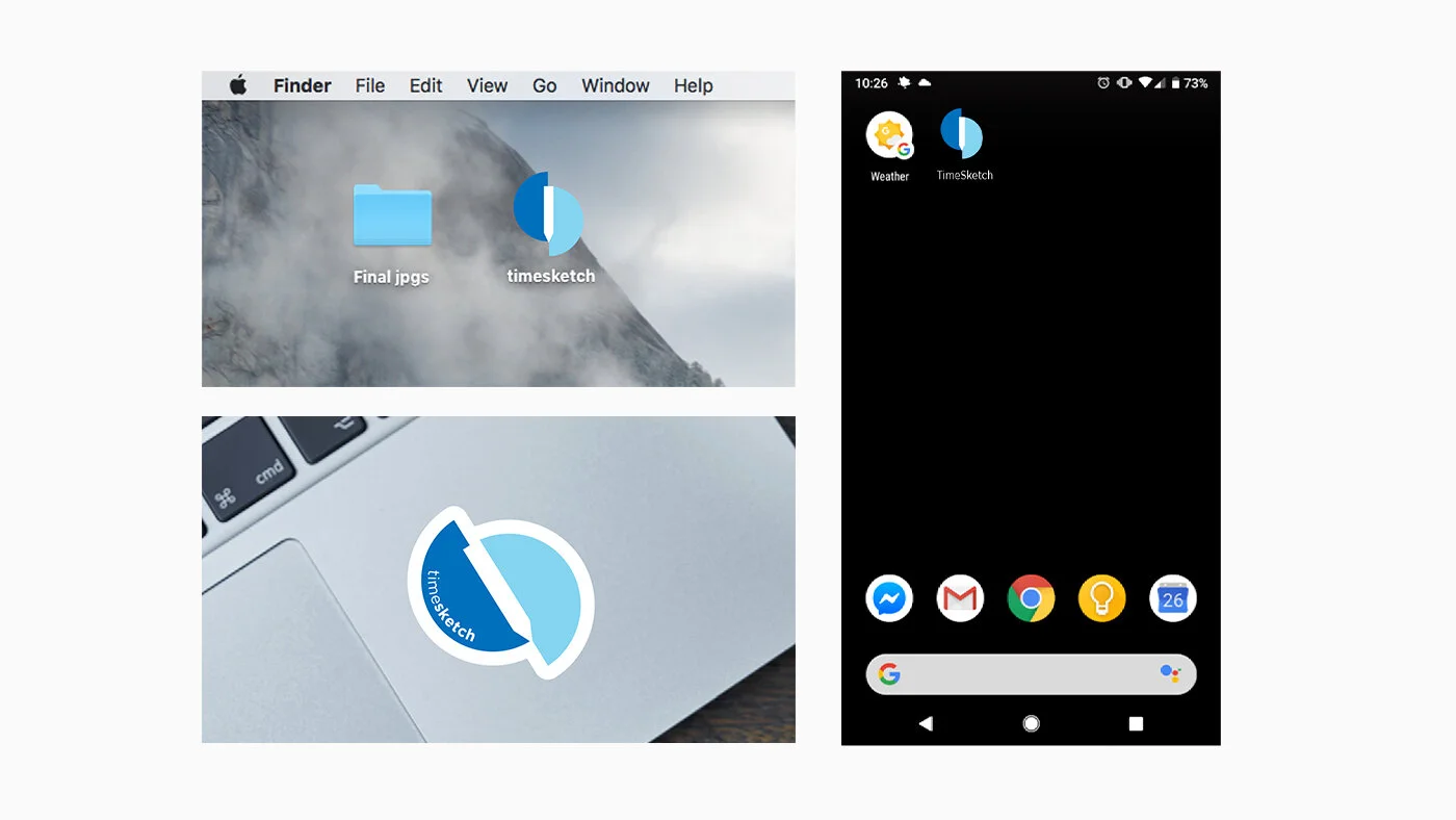
Examples of logomark applications