
Bemis Center for Contemporary Art

Photo © Bemis Center for Contemporary Art
YEAR ONE
For some time, the organization had halted the event for a few years and decided to bring it back. During the first year, we played on the concept of “being” or “to be”. The palette played on the idea of bringing color back. So it was a mix of using basic colors yet in vibrant tones against black and white imagery. The typography plays with negative “empty” space representing the years of absence.


YEAR TWO
With an “inaugural” year behind us, came time to design for the second year. During the first year, a variation of RGB colors were used. For the second year, sticking to the concept of basic colors, a variation of CMYK colors were implemented.
At the request of the client, photos of artworks were showcased in the invitation. To show off the “winning” art pieces that got into the juried exhibition, the idea of a sash was the kernel of the whole design concept. The diagonal nature of the sash also makes the design dynamic and active while playing on the concept of being distinguished as a sash commonly indicates.

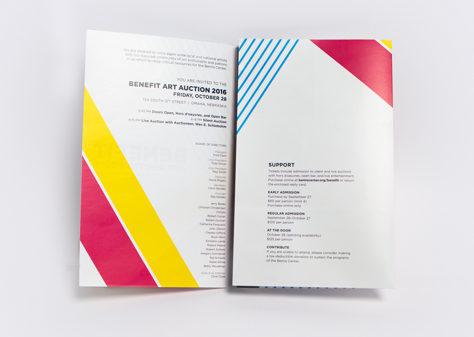
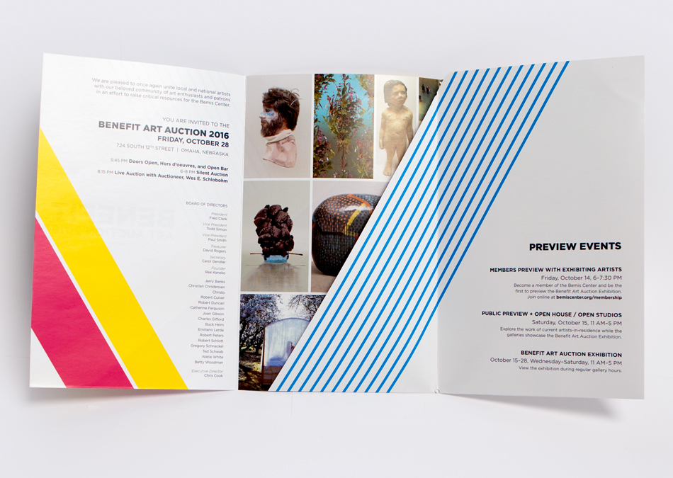
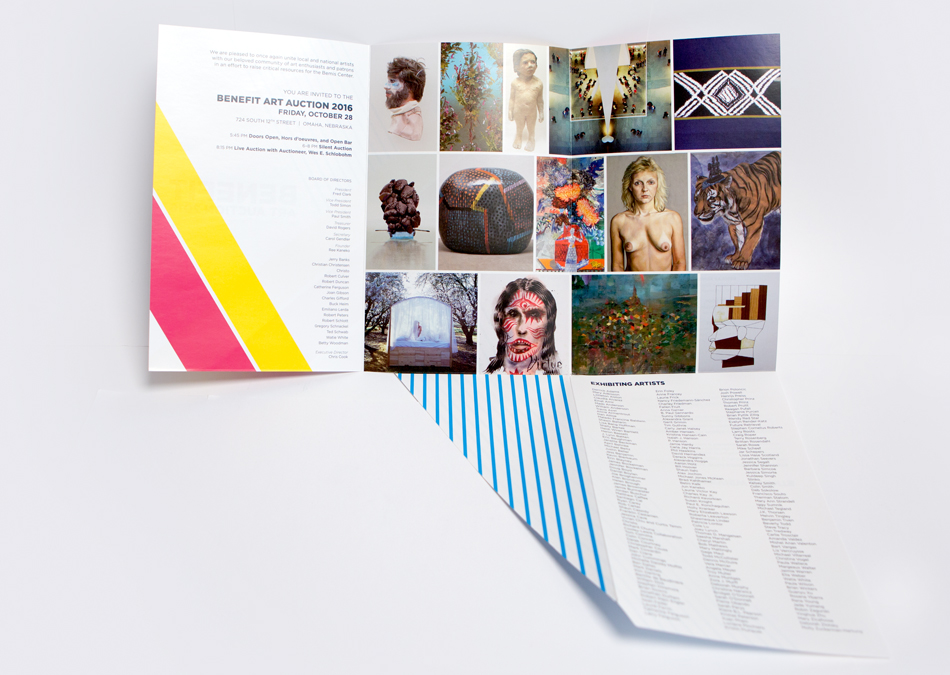
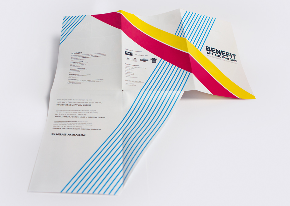


Photo © Bemis Center for Contemporary Art

Photo © Bemis Center for Contemporary Art